Out of Chaos an organizing newsletter
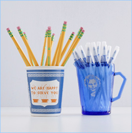
Merchandising
Once, I was explaining to a new assistant that no matter how much my clients purged, there still tended to be a fair amount left, and part of our job was to make what is left look good. “Oh, merchandising,” she said. Merchandising, in retail speak, is the art of making the stuff on the shelves look good (you know, what I was telling you to resist in in Out of Chaos #91 ).
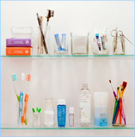
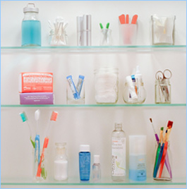
There is always going to be stuff in our homes: There is stuff we need, like what is on the vanity in the bathroom or the counter in the kitchen, and there is stuff we like, which might be on the bookshelves in the living room or hanging on the walls.
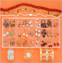
Fortunately, there are a few tricks to make these belongings look good, rather than like clutter. If you have a group of random china, it looks haphazard; but if you have a shelf full of celadon-green china, then it’s a collection. Sometimes my clients have “collections” they aren’t even aware of. In an attempt to bring some cohesion to a display in a client’s dining room recently, we began to remove the things that didn’t “go” (Which of these things is not like the other?). As we tried to fit them into the cabinet, we realized there were other things that did “go” and suddenly there was a collection of blue glass pieces on the windowsill where there had once been clutter.
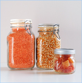
I like to buy my rice and other staples from the bulk section of the grocery store and store them in glass jars. It sure looks better than a bunch of boxes and bags with chip-clips. And they are safer from bugs and spills.
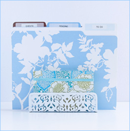
We can apply the same technique to picture frames. I’m not a stager: I think it is nice to have pictures of your family out on a table, but sometimes it gets out of control. Using an organizing principle-like all black-and-white photographs or all silver frames-can make the make them look more planned and less slapdash.
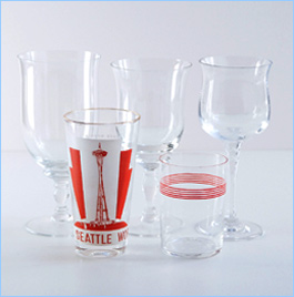
While the trend of organizing books by color appalls me on many levels, I’ll admit that it looks great. I helped one client do this in her living room, but it was mostly art and coffee table books, and not so many volumes that you would be going crazy looking for Angela’s Ashes (Was it grey? Did I leave the jacket on?).
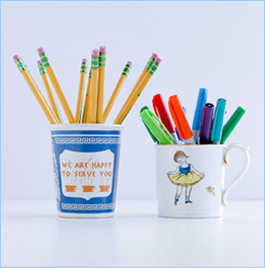
Perhaps this would be a good time to mention that in college, I bought shampoo, lotion and moisturizer solely on the basis of whether or not it was in a white bottle and whether I could peel the label off. I would stand in Walgreens and try peeling back the corner of the St. Ives lotion label to make sure it would come off without leaving a mark. Crazy, I know, but all those plain white bottles looked so great in my little white plastic shelving unit. Also, no one took my stuff: They couldn’t tell which was the shampoo and which was the lotion.
Here’s the deal: We live in an overly visually stimulating world. Sometimes our eyes need a break. This is why we are so attracted to pictures of monochromatic, minimalist homes in Houzz, even as we feel helpless to achieve it. So think small, and ask yourself in what tiny way you can bring a sense of cohesion and simplicity to the clutter you need and love.